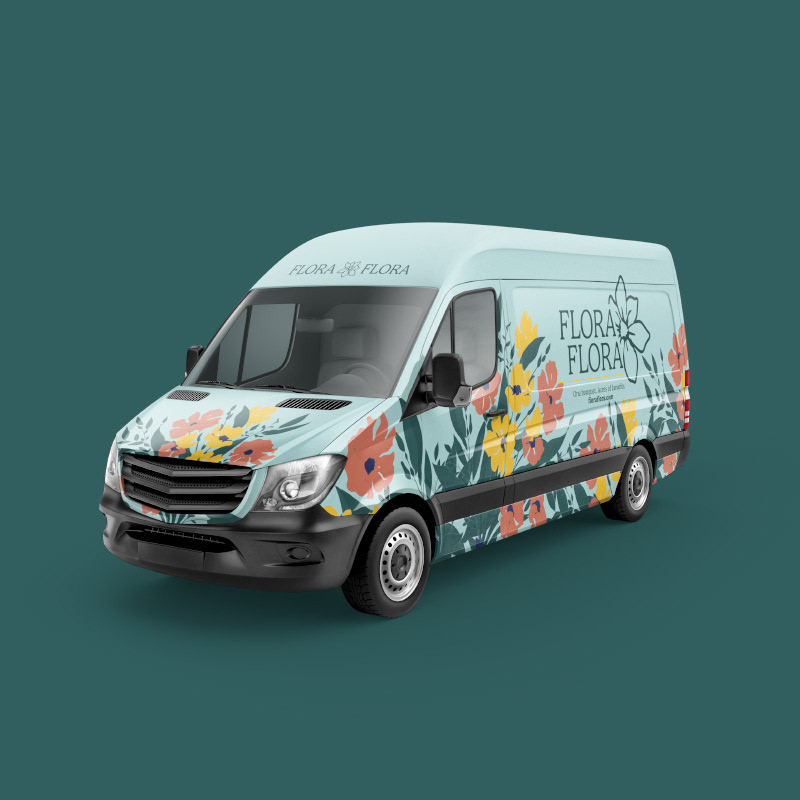
Crafted from surplus blooms, Flora Flora is a sustainable floral delivery that repurposes extra flowers from local farms in Skagit Valley into affordable bouquets for residents of the greater Seattle area. To create a proof of concept for this service quickly, a majority of branding assets were created using generative AI technology.
Problem to solve:
Because of the business model, users receive a bouquet made from whichever varieties of surplus flowers and greenery are currently available from local farms. This helps keep the delivery service affordable but can make for an initial hard sell, as users won't know what the current bouquet looks like until it is delivered. How do we generate trust and convince users to buy a product sight unseen?
Because of the business model, users receive a bouquet made from whichever varieties of surplus flowers and greenery are currently available from local farms. This helps keep the delivery service affordable but can make for an initial hard sell, as users won't know what the current bouquet looks like until it is delivered. How do we generate trust and convince users to buy a product sight unseen?
Solution:
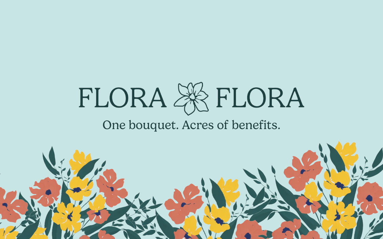
Flora Flora is a proposed online floral delivery service for the greater Seattle area that offers curated seasonal floral arrangements made from surplus flowers (ala the mental model of “ugly produce”) from regional farms. Through value-aligned brand messaging and accessible price points, Flora Flora seeks to inspire trust and create moments of human connection through this sustainable floral delivery service.
“80% of flower sales made in the USA are imported from other countries.” In a state as agricultural rich as Washington State, there is an opportunity to shorten this supply chain and the carbon footprint associated with it. After meeting with several stakeholders, they decided the best way to develop the product was to focus on promoting the positive impacts (on both the planet and local communities) of using Flora Flora instead of traditional floral delivery.
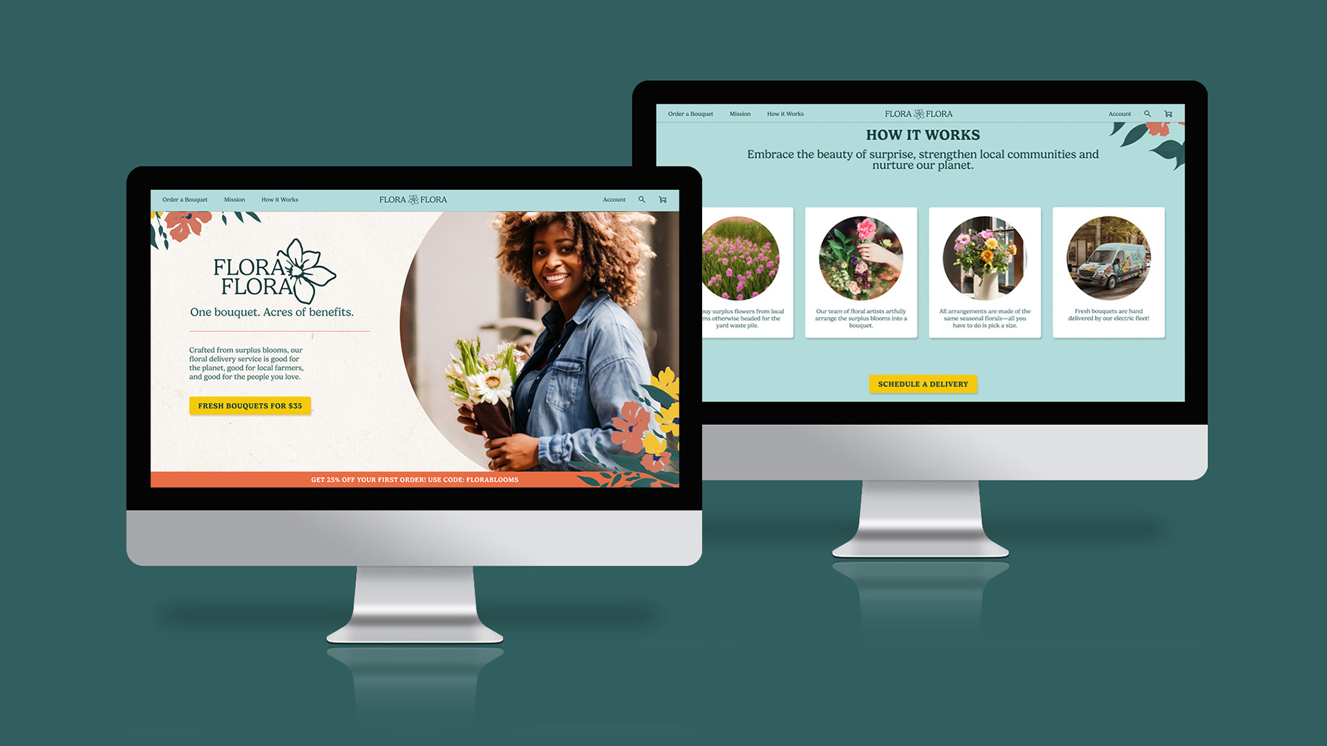
Holding several feedback sessions with stakeholders, I conducted A/B testing of different wireframe prototypes, wrote brand messaging, and created a brand identity and design system using AI-generated photos, icons, and illustrations to quickly generate assets. These assets were used to create a proof of concept by building the Flora Flora product out across a landing page, delivery vehicle, packaging, and marketing collateral. From start to finish, Flora Flora was completed in seven weeks.
Timeframe: 7 weeks
Tools: Figma, Leonardo Ai, Adobe Photoshop, Adobe InDesign

The Process: Research
Initial research into the floral industry
The first step in understanding how to build this product was to research consumer habits in the floral industry. The main findings were that most of cut flowers sold in the US were imported, consumers mostly bought floral arrangements as gifts, and that younger consumers were open to choosing less traditional flowers (not roses).
The first step in understanding how to build this product was to research consumer habits in the floral industry. The main findings were that most of cut flowers sold in the US were imported, consumers mostly bought floral arrangements as gifts, and that younger consumers were open to choosing less traditional flowers (not roses).
About three-quarters of purchases of cut flowers are made with a reason or occasion in mind. The top occasions for purchasing flowers are birthdays and anniversaries. –Society of American Florists
Gen X and Millennials were more likely to say they would buy a flower bouquet within the next year than Boomers. Younger generations also tend to choose a less traditional, more unique cut flower. These generations are also more likely to buy additional non-flower items to go along with that bouquet. –University of Georgia
Competitive analysis—what does the market look like?
Knowing that this product would be following a similar model to the “ugly produce” business model, I divided my competitive analysis into two categories: online floral delivery services (both local and national) and surplus/repurposed food stores.
Knowing that this product would be following a similar model to the “ugly produce” business model, I divided my competitive analysis into two categories: online floral delivery services (both local and national) and surplus/repurposed food stores.
For each of these categories, I looked at three competitor websites. The floral sites were pretty straightforward, and since the number one reason folks buy flowers is for special occasions, they almost all featured birthday flowers or upcoming holiday promotions. Visually they tended towards more simple layouts, featuring basic cards and grid structures to display the products.
My analysis of “ugly produce” sites found that the messaging was very value driven. The most common message was related to sustainability and combating climate change by limiting food waste, with the second common message being affordability. These sites tended to be more visually playful and featured warm and approachable color palettes with photography supplemented by illustrated elements.
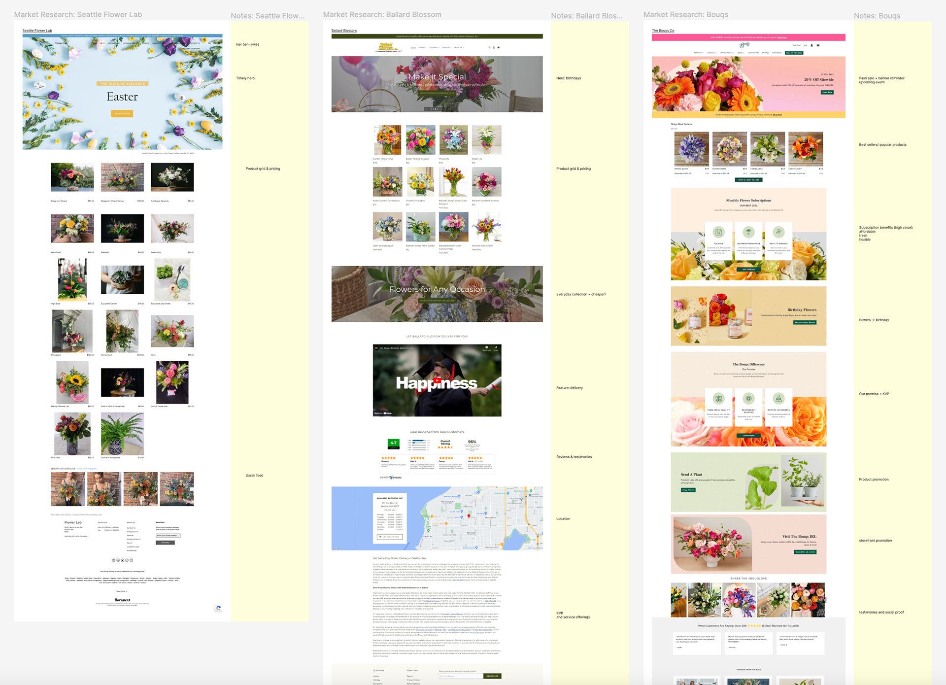
Analysis of floral delivery competitor sites, with annotations in yellow.
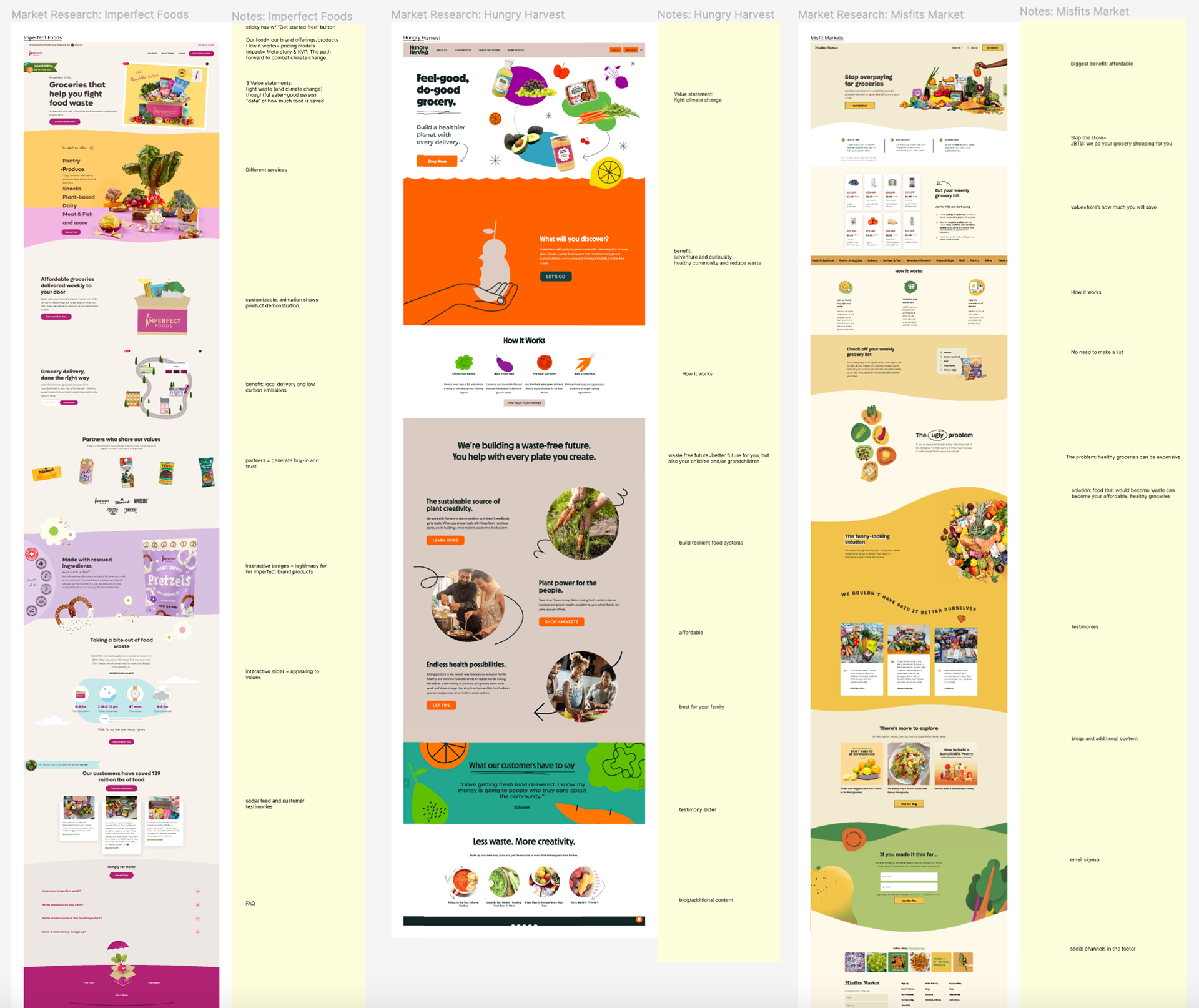
Competitive analysis of “ugly produce” sites.
People buying flowers—who is Flora Flora designed for?
Based on the findings in my initial research, the number one reason folks order flowers is to give them as gifts (Society of American Florists). Based off this, I developed two user archetypes who would be ordering flowers as gifts, and one archetype who might be ordering the service for themselves.
Based on the findings in my initial research, the number one reason folks order flowers is to give them as gifts (Society of American Florists). Based off this, I developed two user archetypes who would be ordering flowers as gifts, and one archetype who might be ordering the service for themselves.
I created each archetype using a Jobs To Be Done framework. In this framework, each archetype might be driven to “hire” the product because it does a job for them. The Urgent Delivery archetype wants to hire Flora Flora to make their loved one feel celebrated when they forgot to get a gift, The Sustainable Gift Giver would hire Flora Flora to be an easy go-to gift option in alignment with their sustainable values, and the Flower Loving Recipient wants to hire a product to improve their overall wellbeing.
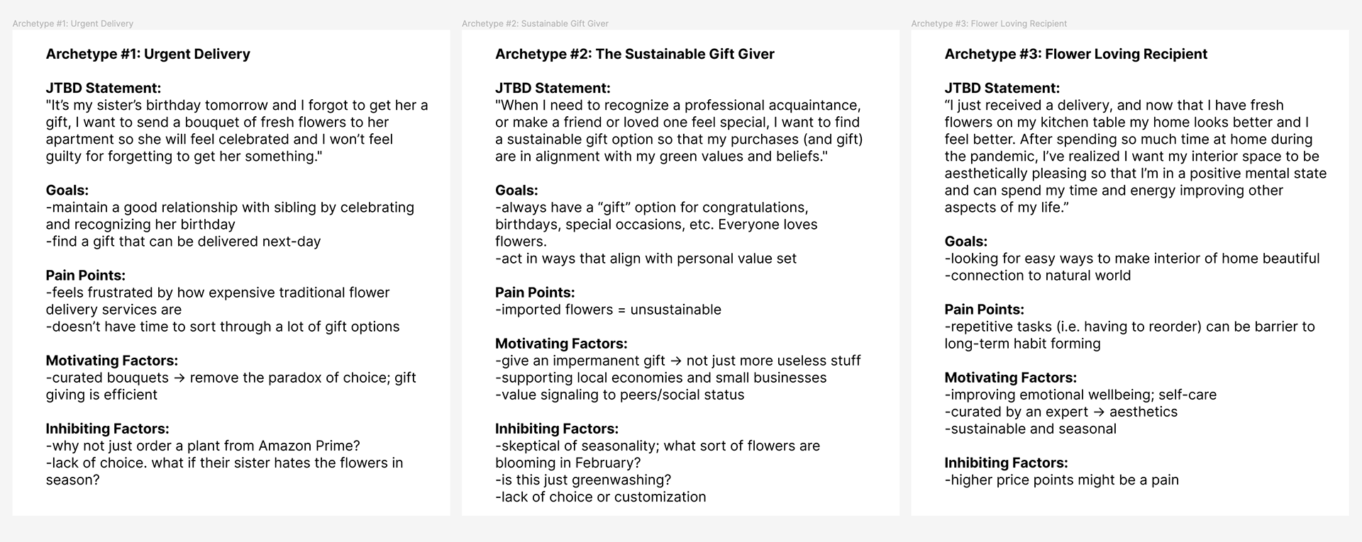
Three user archetypes based on the initial research findings.
How do we generate trust and convince users to buy a product sight unseen?
Because of the business model, users receive a bouquet made from whichever varieties of surplus flowers and greenery are currently available from local farms. This helps keep the delivery service affordable but can make for an initial hard sell, as users won't know what the current bouquet looks like until it is delivered. How do we generate trust and convince users to buy a product sight unseen?
Because of the business model, users receive a bouquet made from whichever varieties of surplus flowers and greenery are currently available from local farms. This helps keep the delivery service affordable but can make for an initial hard sell, as users won't know what the current bouquet looks like until it is delivered. How do we generate trust and convince users to buy a product sight unseen?
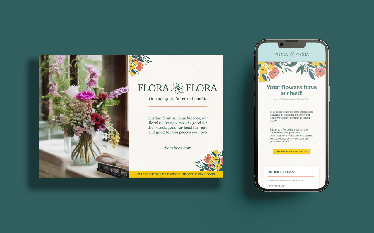
By appealing to users who are already motivated to purchase floral delivery services, but want a product in alignment with their value systems—Flora Flora is a more sustainable solution than traditional floral delivery services, which have long supply chains and large carbon footprints. This strategy to inspire trust is executed through brand messaging.
Another way to inspire trust is to offer affordable price points so that consumers can try the service without a large financial commitment. In order to do this, Flora Flora offers three different ways to purchase a bouquet—two a la carte options, and one monthly subscription service.
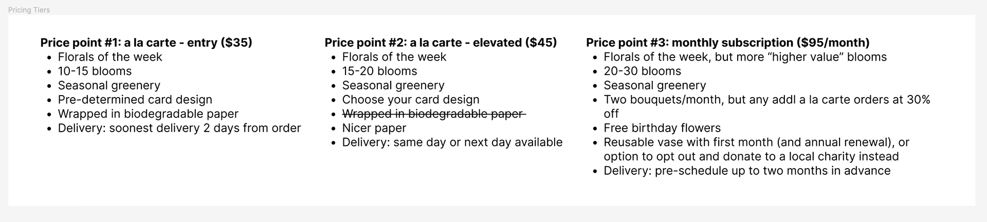
Three proposed pricing tiers for Flora Flora offerings.

The Process: Messaging, Branding & Design System
Branding and messaging that communicates trust and environmental care.
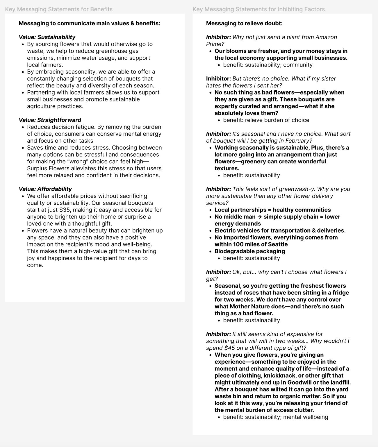
With archetypes determined, I started to develop messaging based on the core values and key differentiators of Flora Flora. The three main values of the brand are sustainability, being straightforward or easy to use, and affordable.
With archetypes determined, I started to develop messaging based on the core values and key differentiators of Flora Flora. The three main values of the brand are sustainability, being straightforward or easy to use, and affordable.
In this initial stage of messaging development, I called in stakeholders for their input on which value, or key differentiator, to pursue. Stakeholders felt that the sustainability tenet was the strongest message, and advised leaning into that when continuing to develop the product. They recommended communicating the straightforward/easy to use and affordability benefits as secondary value messages.
In an effort to generate trust from the users and encourage them to try the product, I also began to develop messaging that responded to the inhibiting factors (barriers) of each archetype that would prevent them from using this product.
Beginning to write copy and explore the main messaging for Flora Flora.
Creating a visual identity for an everchanging product
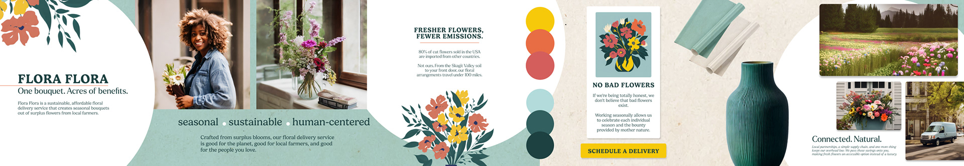
When creating a visual identity for Flora Flora, I looked to my market research and then tried to create a combination of the simplicity of traditional floral delivery services and the playful, modern approach of the “ugly produce” sites. The branding also needed to reflect the core brand values of sustainability, ease of use, and attainability.
When creating a visual identity for Flora Flora, I looked to my market research and then tried to create a combination of the simplicity of traditional floral delivery services and the playful, modern approach of the “ugly produce” sites. The branding also needed to reflect the core brand values of sustainability, ease of use, and attainability.
Colors and Typography
Flora Flora has an overall warm color palette. The hero colors are light blue and teal, implying sustainability and freshness. Yellow, orange, and red are used as accent colors to add warmth and human connection.
Flora Flora has an overall warm color palette. The hero colors are light blue and teal, implying sustainability and freshness. Yellow, orange, and red are used as accent colors to add warmth and human connection.
Gelica is the single typeface used in this product, as it has enough different weights to create contrast between body and headlines. The type scale is a Major Second ratio based off of 16px/1rem, providing a flexible typographic system that provides enough contrast for both mobile and web layouts.
Illustrations
Drawing inspiration from "ugly produce" sites, I decided to incorporate simple illustrations in the Flora Flora branding, along with photography. These illustrations were particularly important for this brand because they helped avoid making false promises to the consumers. Since the actual product is always changing, illustrations provide an evergreen solution to represent flowers without implying a specific bouquet that a customer will receive. Moreover, illustrations add visual interest to the brand collateral and also appear on cards on the homepage.
An early stylescape exploring brand elements and applications.
Generative Technology
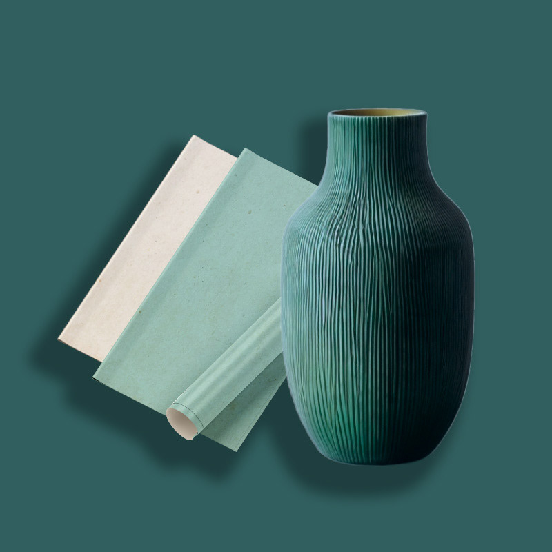
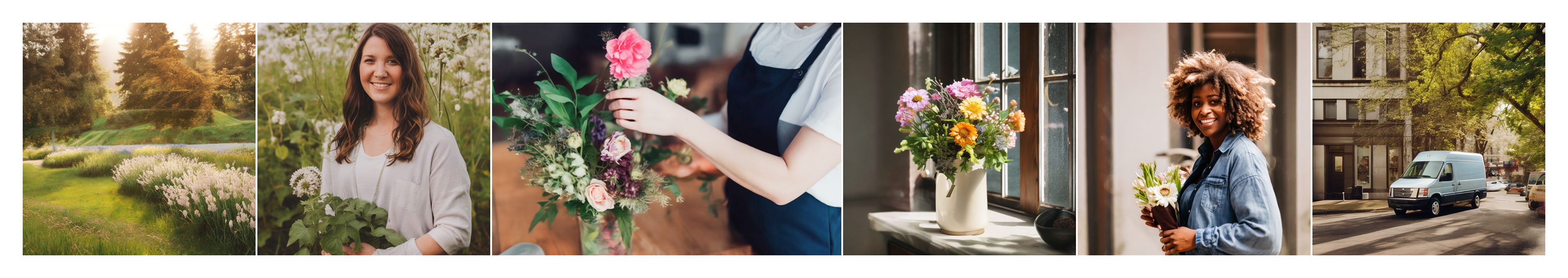
One of the challenges of this project was to use AI-generated images and assets to create a proof-of-concept product. These images would be used for photography and illustrated icons. Using Leonardo Ai (a free tool) I generated images of the product, the delivery van, the vase delivered with the bouquets, illustrated icons for cards, images of farmers, customers, and of the founder of Flora Flora.
One of the challenges of this project was to use AI-generated images and assets to create a proof-of-concept product. These images would be used for photography and illustrated icons. Using Leonardo Ai (a free tool) I generated images of the product, the delivery van, the vase delivered with the bouquets, illustrated icons for cards, images of farmers, customers, and of the founder of Flora Flora.
This wasn't my first experience using an AI image generation platform, so I was already familiar with prompt writing. However, it was my first time using Leonardo.Ai, and there was a bit of a learning curve to produce results that felt cohesive and from the same brand.
Images generated using Leonardo.Ai
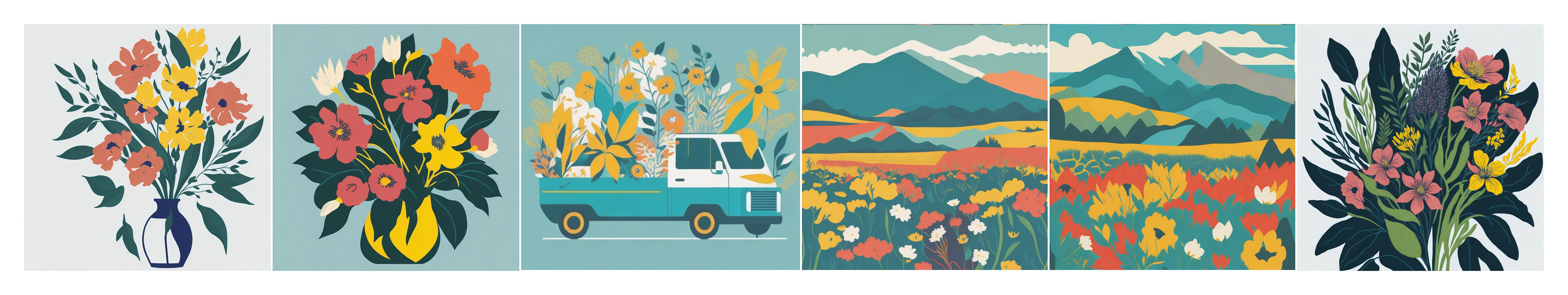
Illustrations for icons generated in Leonardo.ai
Building a simple design system using the principles of atomic design
I'm a big believer in design systems and the principles of atomic design developed by Brad Frost. Working in Figma, I created a flexible design system of components so that I could easily respond to feedback from stakeholders and quickly make changes as needed.
I'm a big believer in design systems and the principles of atomic design developed by Brad Frost. Working in Figma, I created a flexible design system of components so that I could easily respond to feedback from stakeholders and quickly make changes as needed.
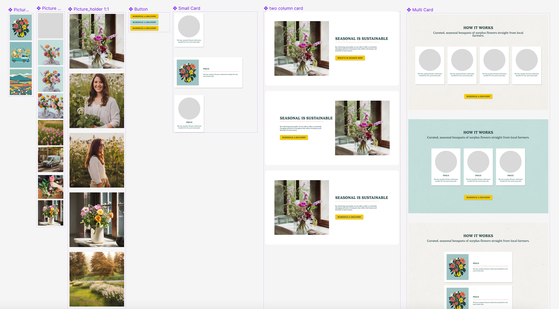
Atomic design “atoms”, “molecules”, and “organisms”—design elements and card styles to create layouts.

The Process: A/B Testing
Knowing that sustainability within the floral delivery world was the key value Flora Flora wanted to communicate, I developed two wireframes website landing pages for stakeholder review. Both focused on communicating the positive benefits of ordering floral delivery from Flora Flora, but played with different information hierarchy and messaging.
Wireframe A focused on sustainability by educating the user about the traditional floral delivery chain of supply (importing flowers from outside the country), the benefits of ordering seasonal products, and how ordering surplus flowers can help reduce local agriculture waste.
Wireframe B communicated sustainable values through a human experience/community connection lens. This wireframe emphasized how ordering from this service would help local farmers, and create stronger local communities. Additionally, it focused on the impact that fresh flowers can have on individual happiness.
After creating these two separate wireframes, I conducted a meeting with five stakeholders and asked them to look over the two wireframes. I didn’t give them any context, except that both focused on communicating sustainable values in different ways. I asked them to use dot voting on any particular messages or portions of the two wireframes that were working well or really weren’t working at all, and then cast their overall vote.
Ultimately Wireframe B, the human connection wireframe received more support, and so I moved forward with further refining the wireframe and product that would ultimately become the final deliverables.
You can view the results of this meeting (including stakeholder comments) in this Figma file.
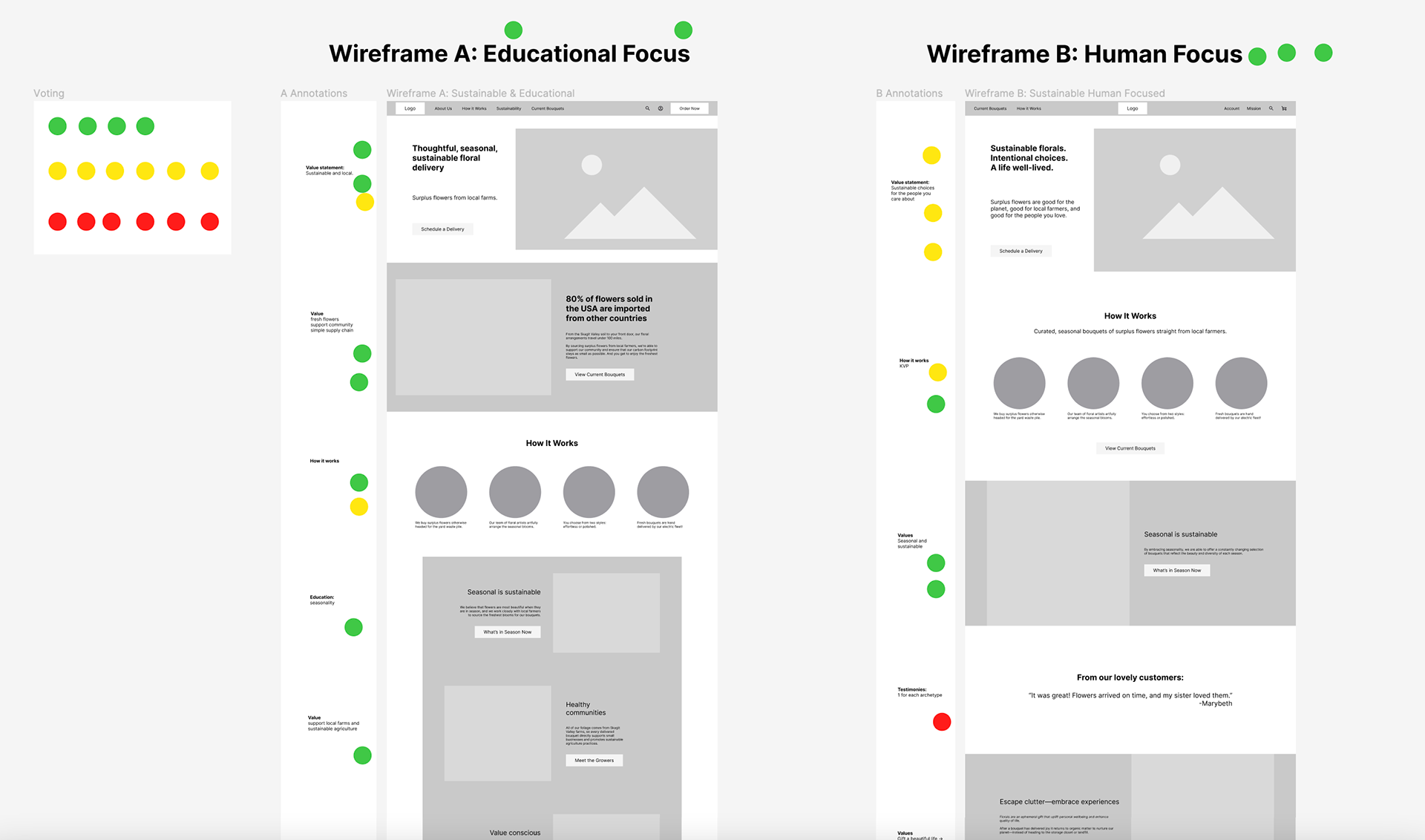
A/B testing two homepage wireframes with five key stakeholders.
Changes made based on stakeholder feedback
1) Explain how the service works as early as possible in the homepage layout, and clarify that the only choice comes in choosing a pricing tier—the consumer has no choice over the flowers in the bouquets.
1) Explain how the service works as early as possible in the homepage layout, and clarify that the only choice comes in choosing a pricing tier—the consumer has no choice over the flowers in the bouquets.
2) Focus messaging less on the mental health and well-being benefits of fresh flowers, and more on the humans involved in the process of growing and arranging the bouquets.
3) Move the product pricing information higher in the wireframe.
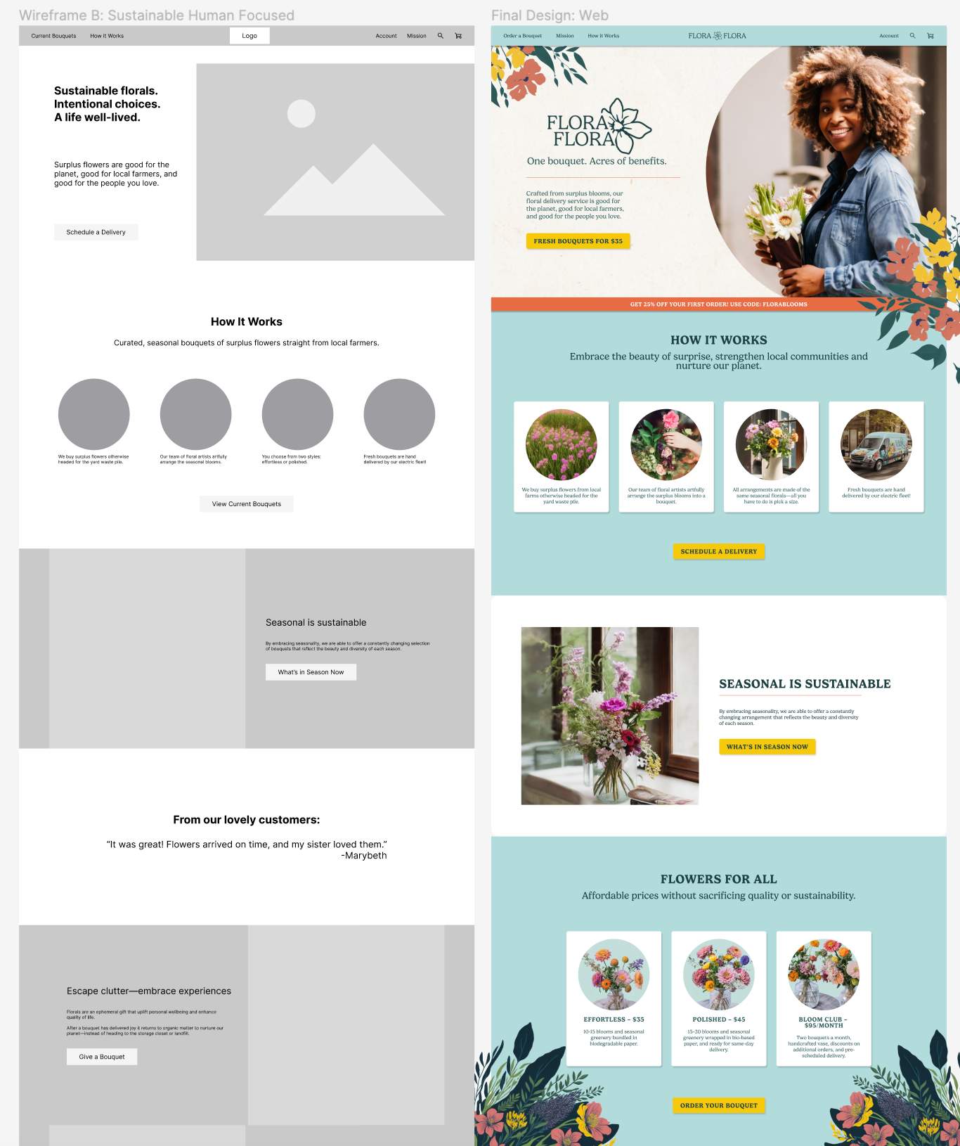
Side-by-side comparison of low-fi wireframe and finished design.
Want to see the final Flora Flora homepage?