Steward is an investment and financial literacy service for young adults (18-25 years old) that makes complex financial information approachable while offering ethical wealth management options. This inclusive product offers easy-to-understand financial education content, in-app investing options, and fiscal guidance from certified experts.
Problem to solve:
How might we develop a fintech service that provides education and ethical investment opportunities for young adults beginning their journeys of financial independence?
How might we develop a fintech service that provides education and ethical investment opportunities for young adults beginning their journeys of financial independence?
Solution:
Create a financial product focusing on increasing financial literacy and ESG (Environmental, Social, Governance) investment opportunities with an emphasis on transparency and accessibility created for young adults (18-25). In our research we found that Gen Z are the least confident generation about financial knowledge, are unsure of how to begin investing, and prefer to get their financial information primarily through video format.
So our team set out to make an approachable product that used plain language to explain financial concepts, and to deliver educational content in a video format that users were already familiar with. Our internal north star statement was to create a product that felt like the “comfy couch of finances” where users would feel welcome and supported during their financial journey.

The Process: Research
Competitor Analysis & Demographic Research
Competitive Analysis
To begin solving the problem of “How might we develop a fintech service that provides education and ethical investment opportunities for young adults beginning their journeys of financial independence?” our team began with some initial research.
Competitive Analysis
To begin solving the problem of “How might we develop a fintech service that provides education and ethical investment opportunities for young adults beginning their journeys of financial independence?” our team began with some initial research.
We wanted to develop a product that promoted financial literacy and allowed users to invest and manage their money according to their value systems. First, we wanted to see what financial management products were currently on the marketplace. We looked at multiple products offering banking, investment, wealth management, and even some insurance companies. These included: Marcus, Ally, Nerdwallet, Monarch, Chime, Varo, Modern Life, Intuit Mint, Ellevest, and Aspiration.
Individually, we audited the competing products and deconstructed their hierarchy of information, common UX patterns, and design systems used. Additionally, we took note of the messaging and values each site was communicating.
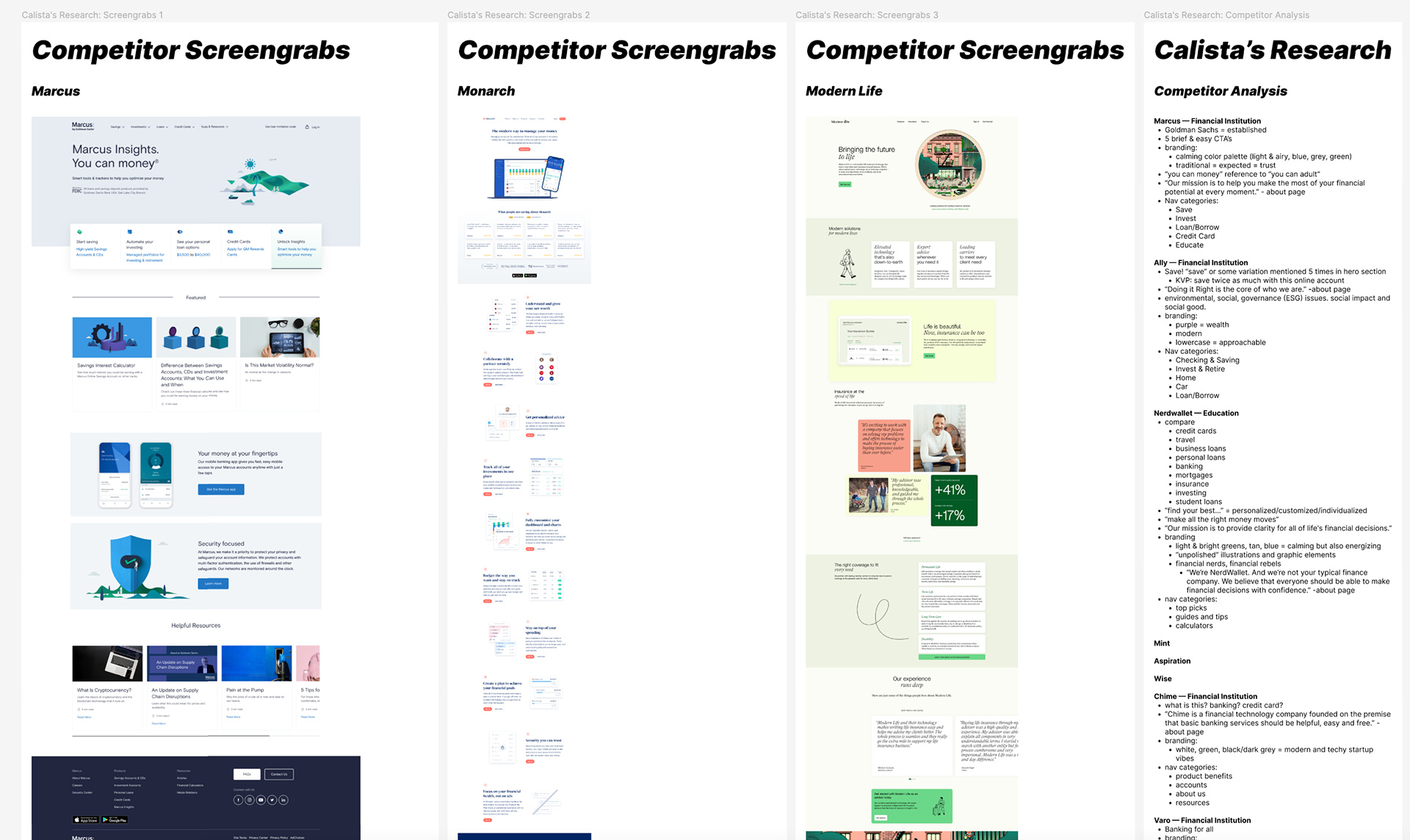
Screengrabs from the homepages of Marcus, Monarch, and Modern Life organized in Figma.
Demographic Research
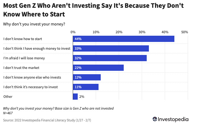
In addition to researching the current fintech marketplace, we also researched the habits and attitudes of Gen Z individuals. Again, we individually conducted research and then met to compare findings and synthesize data. We found several key insights. Most notable are that Gen Z tends to seek financial information and advice through video content, that Gen Z individuals will be more individually responsible for making financial decisions than previous generations, and that ESG (Environment, Social, Governance) investment strategies are experiencing growth in the marketplace.
In addition to researching the current fintech marketplace, we also researched the habits and attitudes of Gen Z individuals. Again, we individually conducted research and then met to compare findings and synthesize data. We found several key insights. Most notable are that Gen Z tends to seek financial information and advice through video content, that Gen Z individuals will be more individually responsible for making financial decisions than previous generations, and that ESG (Environment, Social, Governance) investment strategies are experiencing growth in the marketplace.
“Gen Z is the most video-forward generation when it comes to learning about personal finance in particular...The sheer volume of money-related advice on social media... makes proper vetting a daunting prospect. After all, there is no credential requirement for what one plans to say on Instagram or any other social platform.” –Investopedia
“With recent shifts towards self-service, automation, and always-on availability of apps and digital banking, including pre-approval for mortgages and loans, situations have changed dramatically since even 10 years ago. At the same time, many banks and companies no longer offer the in-depth support of pension professionals investing for the benefit of retirement and 401(k), meaning that Gen Z individuals will have to make more financial decisions than their parents ever did.” –Everfi (from Blackbaud)
U.S. assets under management using ESG strategies increased by 42% and $5.1 trillion between 2018 and 2020. –Nerdwallet
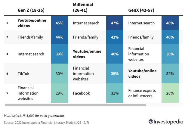
Source: Investopedia
Source: Investopedia
Demographic Survey
To supplement our research, we conducted a survey of our peers and classmates (who fall within the Millenial & Gen Z demographic) using a Google Form. Our sample size was small with about 30 responses, but the results supported our research findings. The majority of respondents indicated interest in continuing their financial education, with 80% interested in learning about forms of investing. Furthermore, most had selected their current bank out of convenience, or because it was where their parents banked, but 100% of respondents would be willing to switch to a bank that better aligned with their value systems. Additionally, 100% didn’t know how their current financial institution invested their funds.
To supplement our research, we conducted a survey of our peers and classmates (who fall within the Millenial & Gen Z demographic) using a Google Form. Our sample size was small with about 30 responses, but the results supported our research findings. The majority of respondents indicated interest in continuing their financial education, with 80% interested in learning about forms of investing. Furthermore, most had selected their current bank out of convenience, or because it was where their parents banked, but 100% of respondents would be willing to switch to a bank that better aligned with their value systems. Additionally, 100% didn’t know how their current financial institution invested their funds.
Our north star: create the “Comfy Couch” of fintech apps
Based on our research, we found that there was an opportunity to create an ESG investment and financial literacy product for Gen Z users.
But we wanted our app to feel different from current fintech apps. We wanted to create a place where users would feel safe to ask questions and learn, and where users are invited to relax in to their finances and trust that Steward will help them every step of the way. We wanted to create the “comfy couch” of finances—a product that was inviting, comfortable, reassuring, familiar, supportive, and safe—and this became our north star statement when designing Steward.

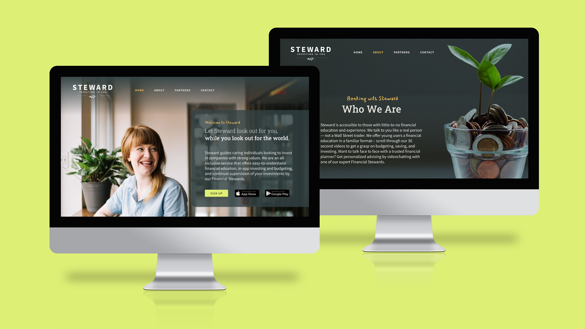
Steward—the “comfy couch” of fintech apps. Image source: Wayfair
Who is Steward designed for?
Using a Jobs To Be Done framework and the findings from our research, we developed three main archetypes for potential users which include goals, pain points, and motivating and inhibiting factors. The Activist is seeking a financial company that aligns with their values, The Beginner wants to become more financially literate with the ultimate goal of financial independence, and The Investor is looking to build a stable financial future. These archetypes guided the UX development of the product.
Using a Jobs To Be Done framework and the findings from our research, we developed three main archetypes for potential users which include goals, pain points, and motivating and inhibiting factors. The Activist is seeking a financial company that aligns with their values, The Beginner wants to become more financially literate with the ultimate goal of financial independence, and The Investor is looking to build a stable financial future. These archetypes guided the UX development of the product.
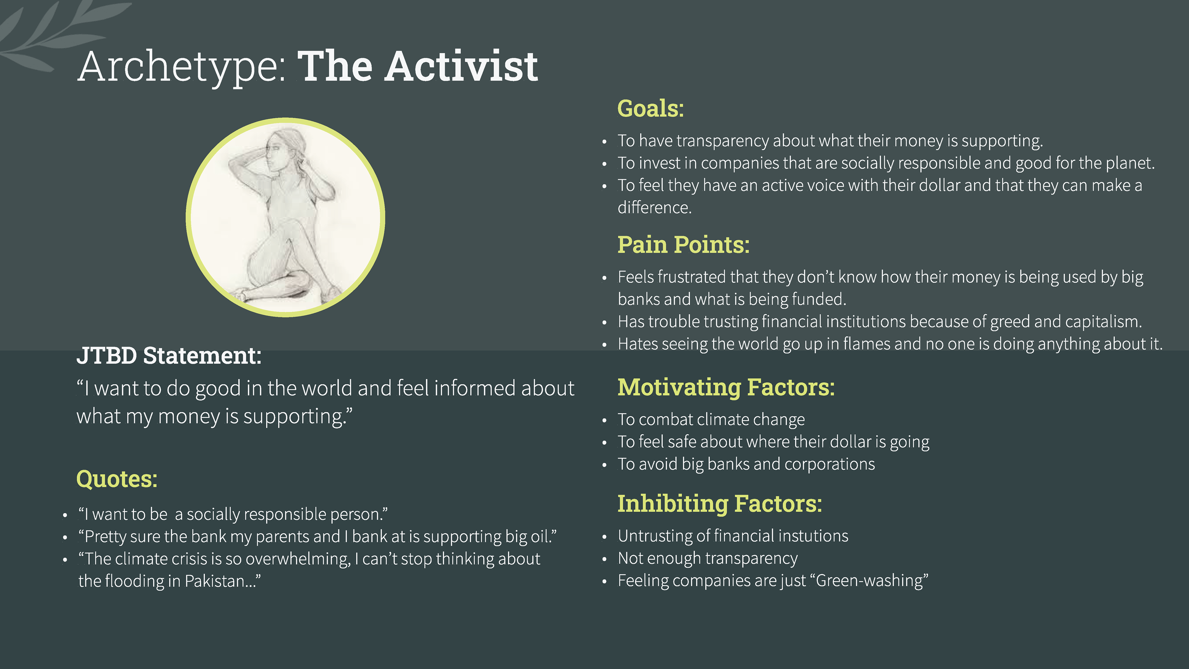
The Activist
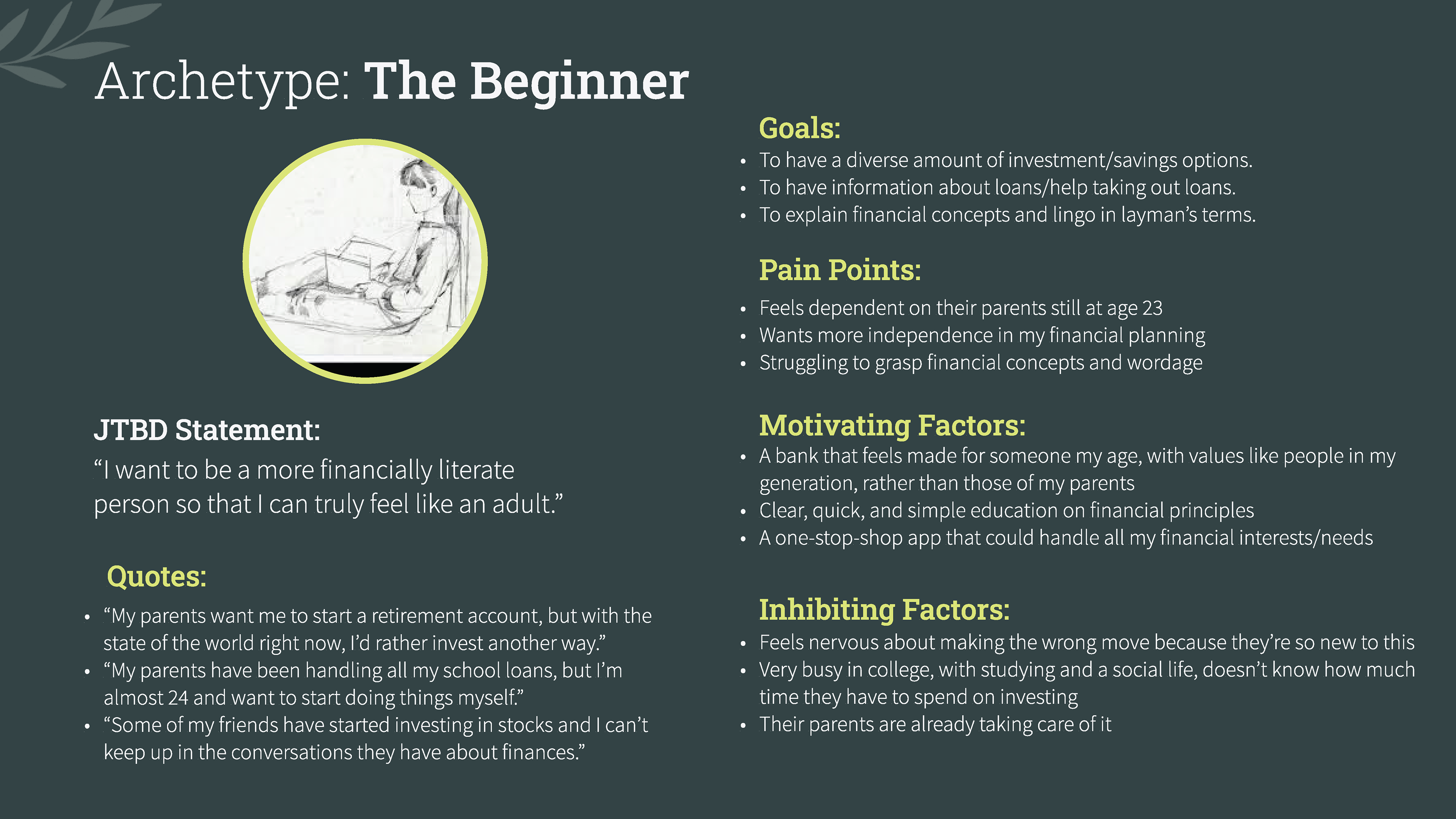
The Beginner
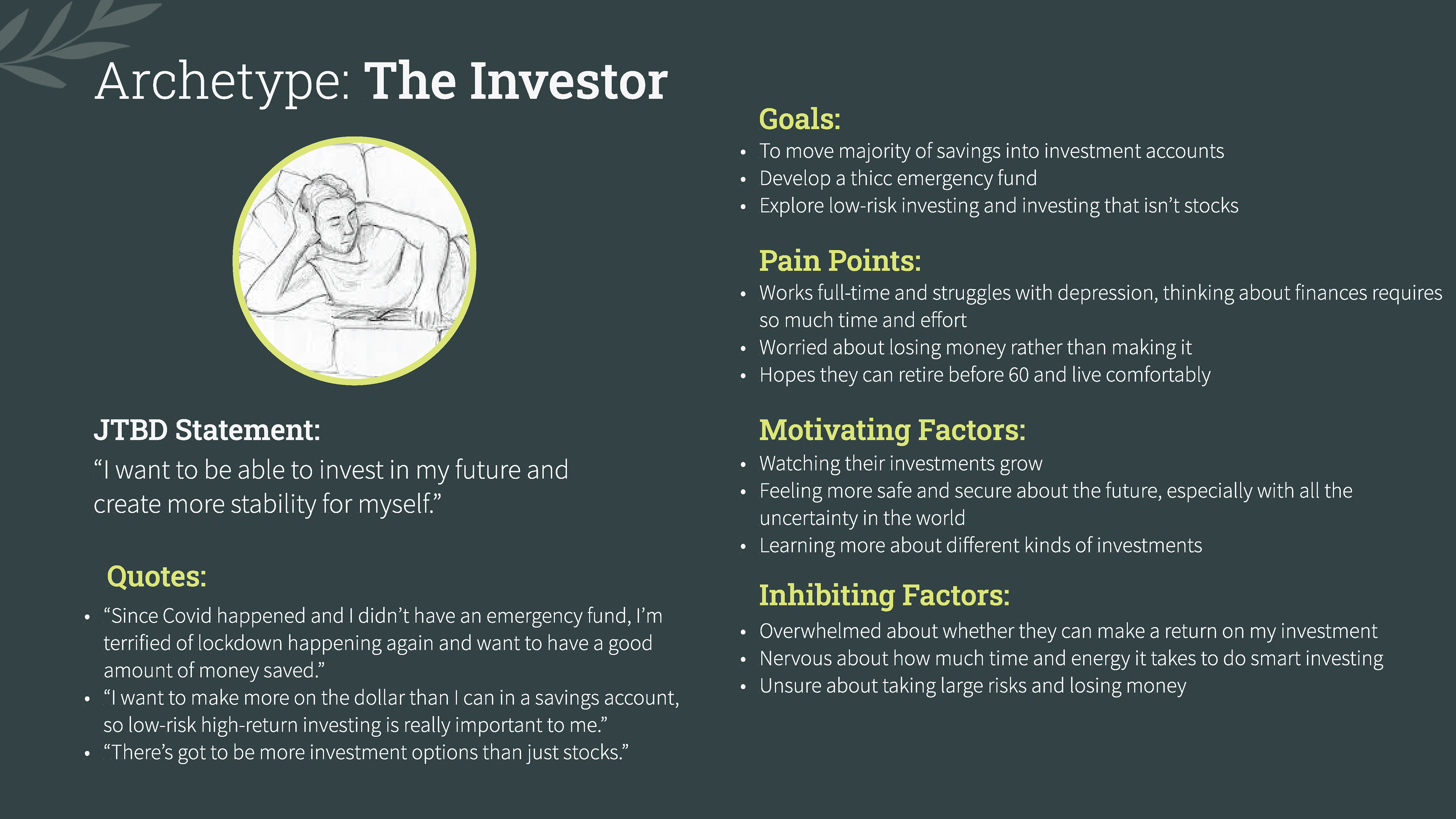
The Investor

The Process: Branding & Design System
Stylescape and branding, but make it comfy.
With our north star statement and archetypes nailed down, we began to explore the visual look and feel of Steward. Thinking of the “comfy couch” we wanted the overall tone to be approachable and friendly, but also professional enough to inspire trust (our experts are managing money, after all). To make the app comfy and inviting, we also knew that we would avoid unnecessary financial jargon as much as possible.
With our north star statement and archetypes nailed down, we began to explore the visual look and feel of Steward. Thinking of the “comfy couch” we wanted the overall tone to be approachable and friendly, but also professional enough to inspire trust (our experts are managing money, after all). To make the app comfy and inviting, we also knew that we would avoid unnecessary financial jargon as much as possible.
Brand Elements
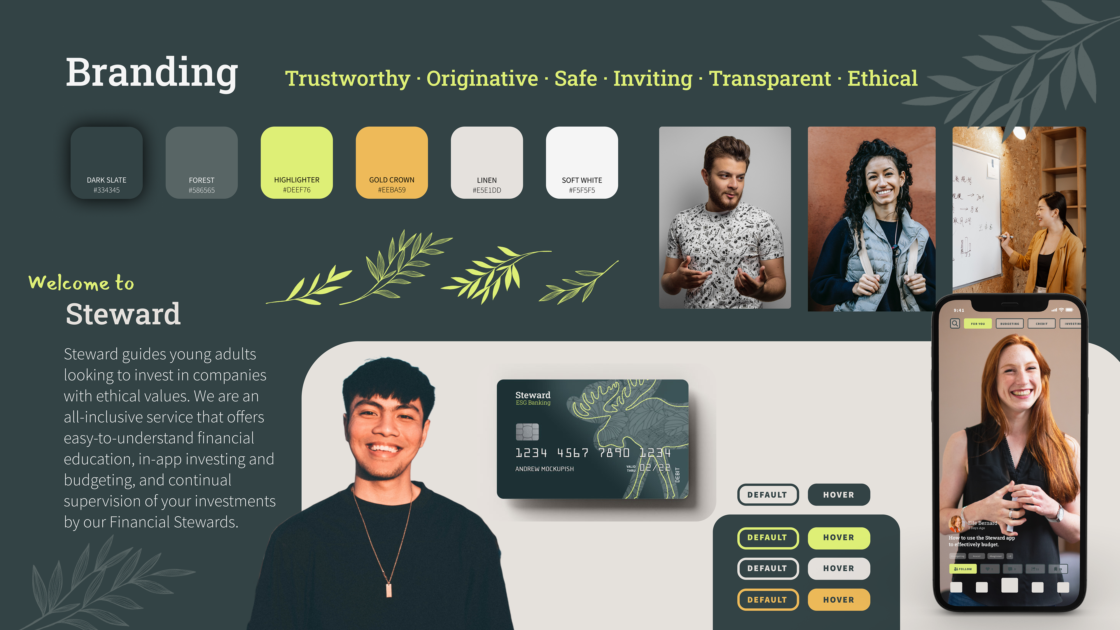
We incorporated a leaf to represent Steward's commitment to growth and ESG investment, and chose a line drawing of a leaf—this is seen repeated throughout the site, and also in the logo. In keeping with our core value of inviting, the typography is accessible but with a sprinkle of handwritten accents to bring humanity and “comfiness” back to the brand.
We incorporated a leaf to represent Steward's commitment to growth and ESG investment, and chose a line drawing of a leaf—this is seen repeated throughout the site, and also in the logo. In keeping with our core value of inviting, the typography is accessible but with a sprinkle of handwritten accents to bring humanity and “comfiness” back to the brand.
Colors
When choosing brand colors, we wanted to strike a balance between trust, innovation, and comfort. The hero color, a deep green suggests wealth, connection, and sustainability. When paired with the accents of neon green and bright orange gold, the color combo feels energizing and has the right balance of familiar and fresh. When developing a color palette, we made sure to test the potential for both light mode and dark mode applications.
When choosing brand colors, we wanted to strike a balance between trust, innovation, and comfort. The hero color, a deep green suggests wealth, connection, and sustainability. When paired with the accents of neon green and bright orange gold, the color combo feels energizing and has the right balance of familiar and fresh. When developing a color palette, we made sure to test the potential for both light mode and dark mode applications.
Photos
Imagery of users should be from the target demographic, look relatable, and not be overly styled or appear too aspirational. Financial experts shouldn't be the stereotypical “suit and tie” associated with financial management, but like the Alexandria Ocasio-Cortez of the financial realm—young enough for users to relate to, but in the top tier of their profession to create credibility.
Imagery of users should be from the target demographic, look relatable, and not be overly styled or appear too aspirational. Financial experts shouldn't be the stereotypical “suit and tie” associated with financial management, but like the Alexandria Ocasio-Cortez of the financial realm—young enough for users to relate to, but in the top tier of their profession to create credibility.

Initial stylescape showing how the brand might be expressed in different situations
The logo—a journey in clarity and simplification
Developing a logo for this product was a struggle. We wanted a logo that felt warm and inviting, and had the idea that an animal guide could be the “steward” shepherding users towards a more financially stable future. Initially, we chose a moose because it seemed steady and wise.
Developing a logo for this product was a struggle. We wanted a logo that felt warm and inviting, and had the idea that an animal guide could be the “steward” shepherding users towards a more financially stable future. Initially, we chose a moose because it seemed steady and wise.
With this in mind, I created a first draft of potential logos for team review. Our first round of logos included this moose. However, as we continued to build and clarify the product, we decided that the concept of an animal guide no longer fit with our “comfy couch” internal north star. Furthermore, it was confusing for users, as the moose mascot was competing for attention with our human financial experts. So, we eventually dropped the mascot in week 9 of development and opted to go with a more traditional wordmark. This wordmark helps to establish trust and credibility but includes a motif and tagline that reminds users of Steward’s ESG values.
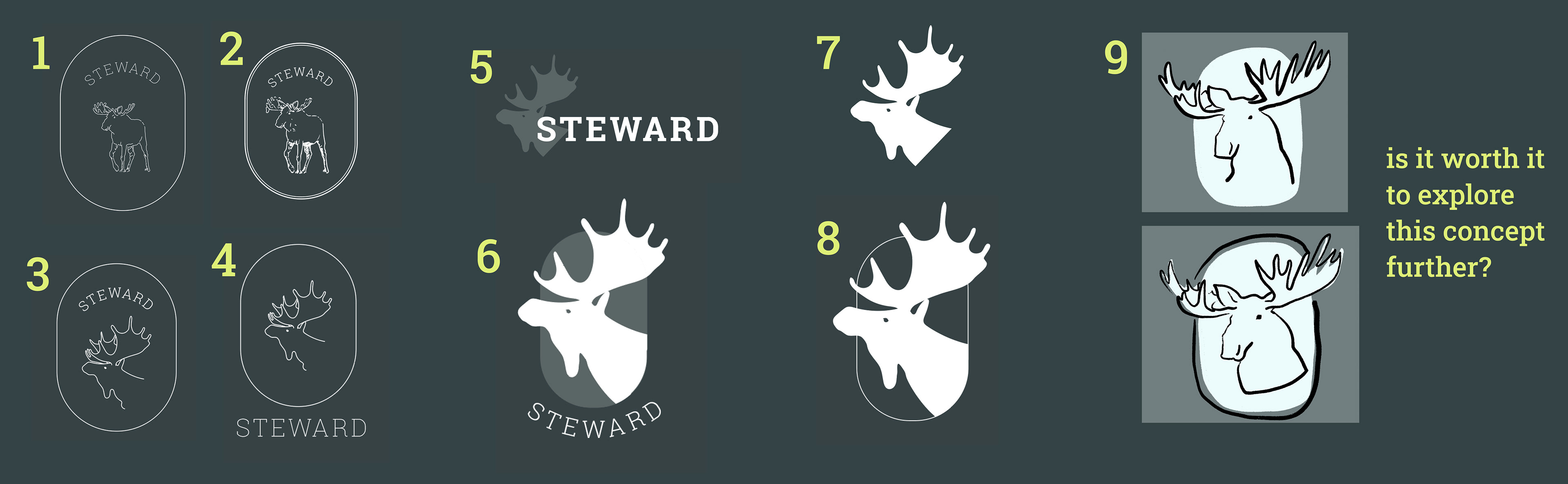
Logo drafts #1
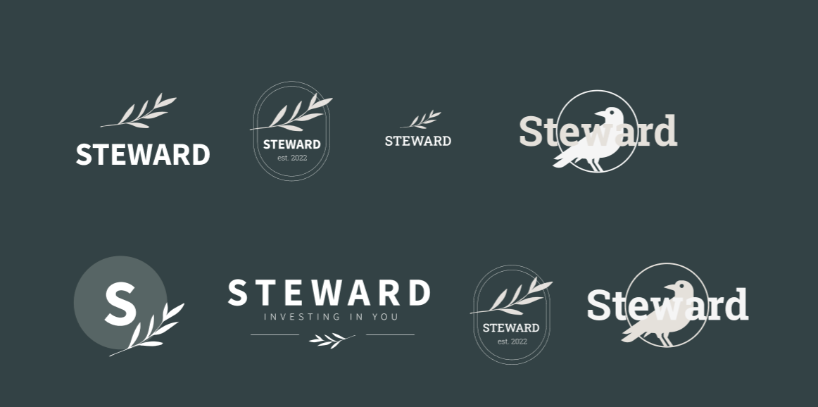
Logo design sprint, including the final wordmark
Creating a mobile design system using the principles of atomic design
Our team worked in Figma to create proof of concept prototypes for both web and mobile versions of the Steward app. I was responsible for creating a design system for mobile platforms that aligned with the branding. In order to create a product that could easily be adjusted as needed, I followed the principles of atomic design developed by Brad Frost to create design atoms, molecules, and organisms. This made it easy to create consistent UI layouts across the app and to adjust the product based on stakeholder feedback.
Our team worked in Figma to create proof of concept prototypes for both web and mobile versions of the Steward app. I was responsible for creating a design system for mobile platforms that aligned with the branding. In order to create a product that could easily be adjusted as needed, I followed the principles of atomic design developed by Brad Frost to create design atoms, molecules, and organisms. This made it easy to create consistent UI layouts across the app and to adjust the product based on stakeholder feedback.
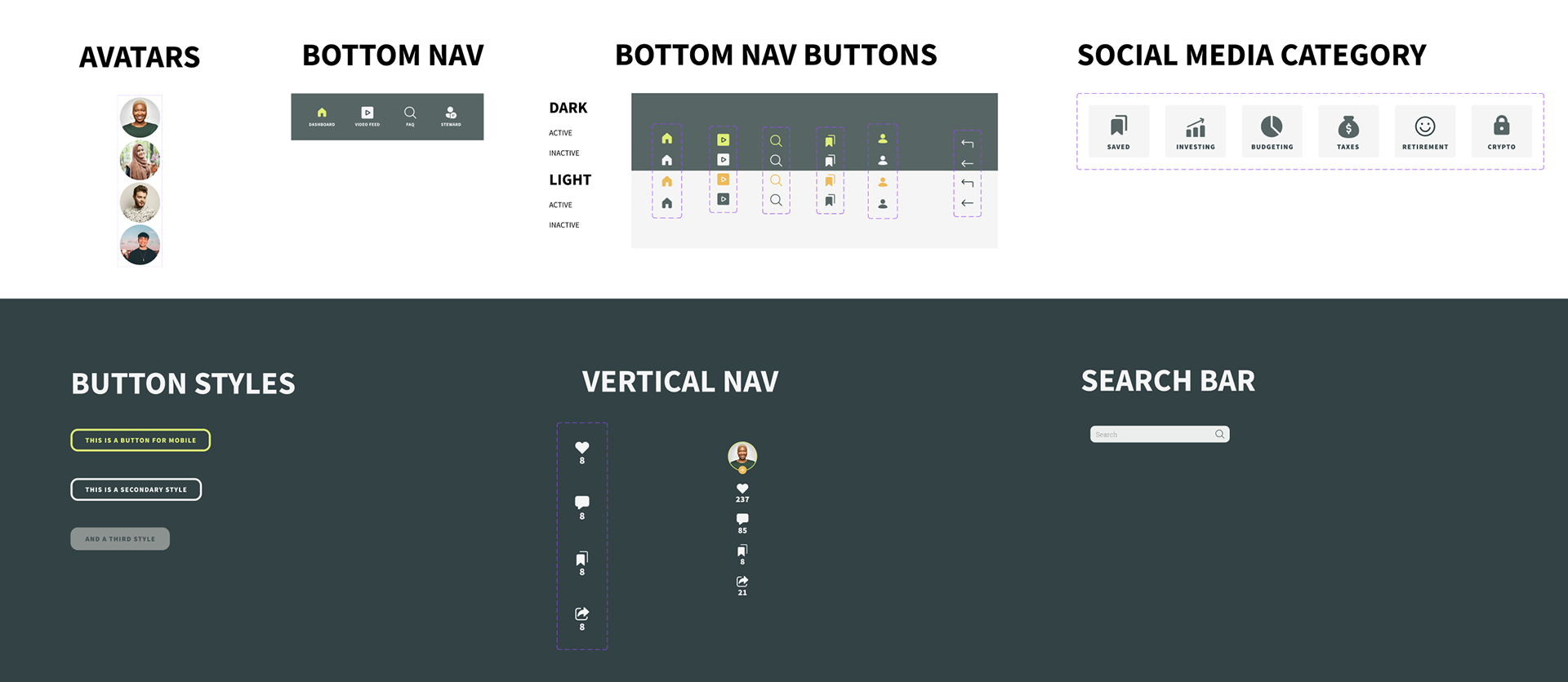
Atomic design “atoms”—the building blocks of more complex components
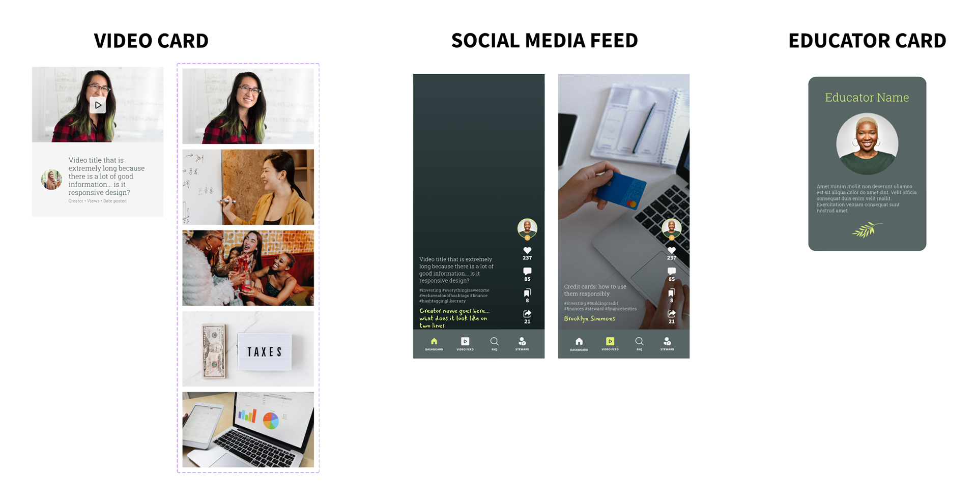
Atomic design “molecules” and “organisms”—card styles that can be repeated throughout the app

The Process: Task Flow Development
Task flow designed around an archetype: The Beginner
From our user archetypes, we created two mobile app task flows and one web app task flow. My assigned archetype was The Beginner—the user who is interested in becoming more financially literate, and therefore, more independent.
From our user archetypes, we created two mobile app task flows and one web app task flow. My assigned archetype was The Beginner—the user who is interested in becoming more financially literate, and therefore, more independent.
The Beginner
Job To Be Done
“I want to be a more financially literate person so that I can truly feel like an adult.”
“I want to be a more financially literate person so that I can truly feel like an adult.”
Goals:
• To have a diverse amount of investment/savings options.
• To have information about loans/help taking out loans.
• To explain financial concepts and lingo in layman’s terms.
• To have a diverse amount of investment/savings options.
• To have information about loans/help taking out loans.
• To explain financial concepts and lingo in layman’s terms.
Pain Points:
• Feels dependent on their parents still at age 23
• Wants more independence in my financial planning
• Struggling to grasp financial concepts and wordage
• Feels dependent on their parents still at age 23
• Wants more independence in my financial planning
• Struggling to grasp financial concepts and wordage
Motivating Factors:
• A bank that feels made for someone my age, with values like people in my generation, rather than those of my parents
• Clear, quick, and simple education on financial principles
• A one-stop-shop app that could handle all my financial interests/needs
• A bank that feels made for someone my age, with values like people in my generation, rather than those of my parents
• Clear, quick, and simple education on financial principles
• A one-stop-shop app that could handle all my financial interests/needs
Inhibiting Factors:
• Feels nervous about making the wrong move because they’re so new to this
• Very busy with school and social life, doesn’t know how much time they have to spend on financial management
• Their parents are already taking care of it
• Feels nervous about making the wrong move because they’re so new to this
• Very busy with school and social life, doesn’t know how much time they have to spend on financial management
• Their parents are already taking care of it
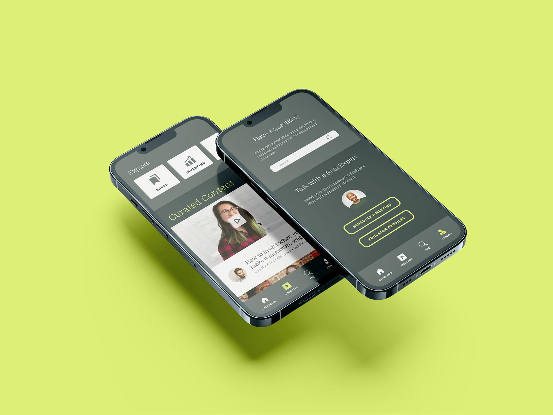
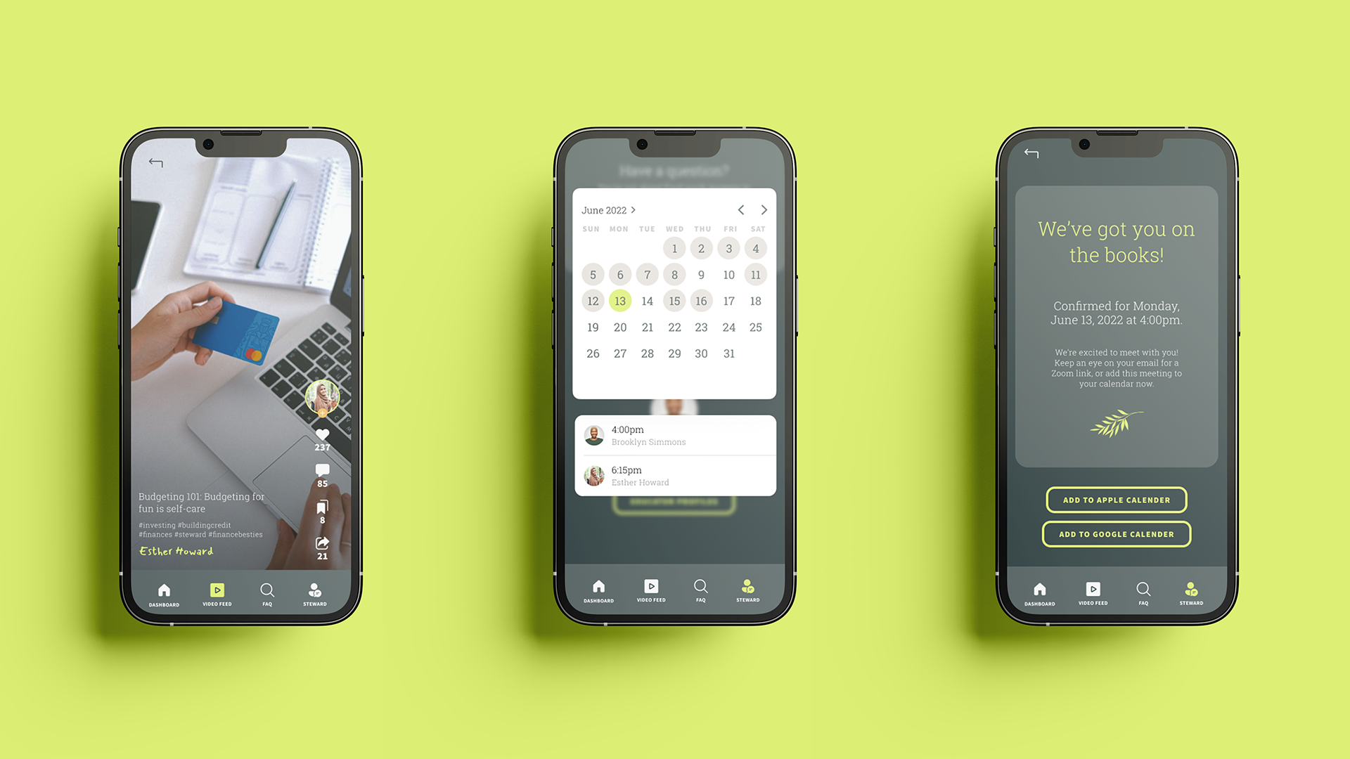
Given that “Gen Z is the most video-forward generation when it comes to learning about personal finance in particular” (Investopedia) we decided the best way to provide quick and simple educational content would be through short videos, ala TikTok. However, unlike TikTok, all of the video content from Steward would be created by certified, vetted financial experts. Furthermore, in order to create a one-stop-shop product, if a user particularly enjoyed content from an expert and wanted a deeper dive into the topic, they would have the option to schedule a video meeting with them to ask more specific questions.
Our team did a low-fi wireframe sprint to create potential task flows for each archetype, following as many familiar mental models as possible (Jakob's Law of UX). For The Beginner task flow, we decided to move forward with Eleanor's wireframe, but I would build the UI and refine the UX elements as needed. Using the design system created in Figma, I was able to quickly build and adjust UI elements as well as make several UX additions to create a more intuitive user experience.
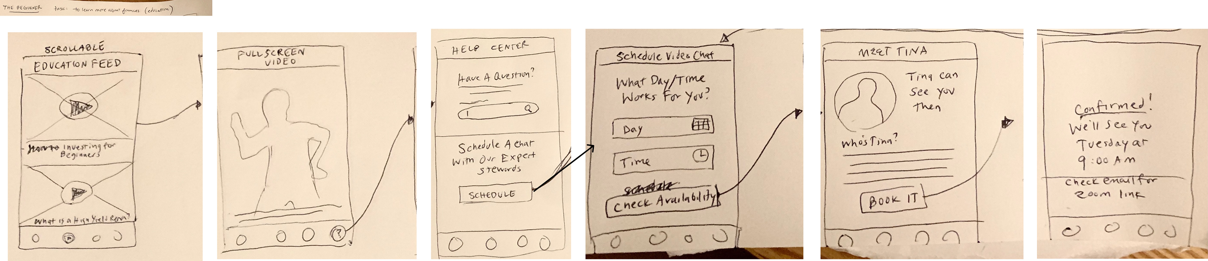
Low-fi wireframe from Eleanor
UX changes I made to the task flow
After initial user feedback, there were some changes to be made to the task flow to create a more intuitive experience. Design is all about iteration and refinement, no?
Changes made:
1) Added a path forward for users to explore specific topics in the form of a side-scroll filtering system at the top of their curated video feed. This is also how a user could access their saved content.
2) Added a vertical, secondary navigation bar to the full-screen video. This provides users with interactive options and context when watching a video. The creator of the video's name and their profile image are highlighted in our CTA color so that a user could easily watch more content from this financial expert.
3) Gave users a new path forward to see all educator profiles if they are looking for a specific expert, or would like to browse profiles based on areas of expertise.
4) Confirmation is provided, as well as an option to add the appointment to a user's Apple or Google calendar.
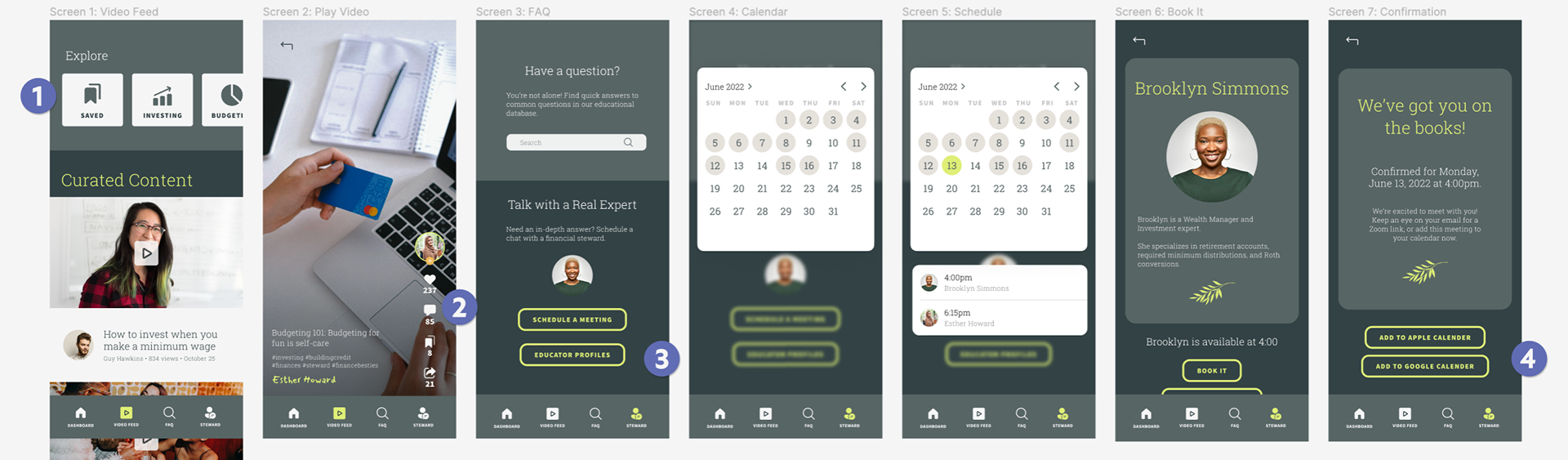
Hi-fi frames built in Figma
Want to see this task flow in action?
heads up, it's a large file and the page might load slowly :)